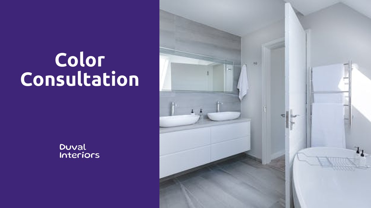
Color Consultation
Table Of Contents
At Duval Interiors, our color consultation service is designed to help our clients choose the perfect color palette for their home or business. Our expert designers will work closely with you to understand your style preferences and desired atmosphere, ultimately creating a color scheme that enhances the space and reflects your personality. Whether you're looking for a bold and vibrant look or a calm and soothing feel, we have the knowledge and expertise to guide you through the process. Our goal is to ensure that you are completely satisfied with the final result, and that your space truly feels like a reflection of you. Trust Duval Interiors for all your color consultation needs.
Choosing the Right Color Palette
Selecting the perfect color palette for a space can be a daunting task, but with the right approach, it can be an exciting and rewarding process. When choosing colors, it is essential to consider the mood and ambiance you want to create in the room. Bright and vibrant colors like yellows and oranges can add energy and warmth, while cooler tones such as blues and greens can create a sense of calm and relaxation.
Moreover, harmonizing colors that complement each other can enhance the overall aesthetics of the space. Whether you opt for a monochromatic scheme using varying shades of the same color or a complementary scheme with colors opposite each other on the color wheel, striking a balance is key. Experimenting with different combinations and considering the size and lighting of the room can help you determine the most suitable color palette that reflects your style and vision.
Understanding Color Theory
Color theory is a fundamental concept that plays a crucial role in the world of design and aesthetics. It provides a systematic approach to understanding how colors interact with one another, creating different visual effects and eliciting various emotional responses. By delving into color theory, one can grasp the principles behind color harmony, contrast, and the overall impact colors have on a space or artwork.
The color wheel is a key tool in understanding color theory, illustrating the relationships among primary, secondary, and tertiary colors. Complementary colors, for example, are positioned opposite each other on the color wheel and create a striking contrast when paired together. Analogous colors, on the other hand, sit next to each other on the wheel and offer a more harmonious and subtle effect when used in combination. By mastering the basics of color theory, one can make informed decisions when selecting color palettes for interiors, graphic design projects, or any creative endeavor.
Importance of Undertones in Color Selection
Understanding undertones is crucial when selecting colors for your space. The undertone of a color can drastically affect how it appears in different lighting conditions. Whether warm or cool, undertones can make a significant difference in the overall look and feel of a room. It's essential to pay attention to these undertones to ensure the colors you choose complement each other harmoniously.
Warm undertones can add a sense of coziness and vibrancy to a room, while cool undertones can create a calm and sophisticated atmosphere. By identifying the undertones in your colors, you can create a cohesive and visually pleasing design scheme. Don't underestimate the power of undertones when selecting colors for your space – they can truly make or break the overall look and feel you are trying to achieve.
Identifying Warm and Cool Undertones
When it comes to identifying warm and cool undertones in color selection, it is crucial to observe how certain hues complement different skin tones and lighting conditions. Warm undertones generally lean towards shades like red, orange, and yellow, while cool undertones tend to be more aligned with blue, purple, and green tones. Recognizing these undertones can help individuals choose the most flattering colors for their clothing, makeup, or home decor.
To determine whether you have warm or cool undertones, take a close look at the veins on your wrist under natural light. If your veins appear more blue or purple, you likely have cool undertones. On the other hand, if your veins seem more greenish, then you probably have warm undertones. Understanding your undertones is essential for creating a cohesive color palette that enhances your features and creates a harmonious environment in any space.
Impact of Lighting on Color Perception
Lighting plays a crucial role in how colors appear in a space. The intensity and type of light can significantly influence the way we perceive different hues within a room. Natural light, such as sunlight, can bring out the true vibrancy of colors and showcase their full potential. On the other hand, artificial lighting, like incandescent or fluorescent bulbs, can cast a different hue on surfaces, altering the way colors are perceived.
When selecting a color palette for a room, it is essential to consider the lighting conditions throughout the day. Colors may look different during the morning, midday, and evening due to changes in natural light. It is advisable to test paint samples under various lighting conditions to ensure the chosen colors will look cohesive and harmonious throughout the day. By understanding the impact of lighting on color perception, you can create a space that reflects your desired ambiance and mood effectively.
Tips for Evaluating Natural and Artificial Lighting
For a successful color consultation, ensuring you accurately evaluate both natural and artificial lighting is essential. Natural light is the purest form of illumination and can drastically affect how colors appear in a space. To evaluate natural lighting, assess how it flows into the room throughout the day. Consider how different natural light sources impact the colors you are working with - whether they are warm or cool tones.
Artificial lighting plays a crucial role in maintaining a consistent color appearance in any space. When assessing artificial lighting, focus on the type of bulbs being used as they can emit different color temperatures. Test how various bulbs influence the colors you are considering, ensuring they harmonize well under artificial lighting conditions. By carefully evaluating both natural and artificial lighting, you can enhance the overall color scheme of a room and create a visually appealing environment.
FAQS
What is color consultation?
Color consultation is a service provided by professionals to help individuals or businesses choose the right colors for their spaces based on various factors such as personal preferences, interior design goals, and practical considerations.
How can understanding color theory benefit me during a color consultation?
Understanding color theory can help you make informed decisions about color combinations, contrasts, and harmonies, leading to a more aesthetically pleasing and cohesive look in your space.
Why are undertones important in color selection?
Undertones play a crucial role in how a color appears in a space, as they can influence the overall mood, atmosphere, and compatibility with other colors. Being mindful of undertones can prevent color clashes and ensure a harmonious color scheme.
How do I identify warm and cool undertones in colors?
Warm undertones typically have hints of red, yellow, or orange, while cool undertones tend to have hints of blue, green, or purple. By comparing different shades and observing their undertones, you can determine whether a color leans warm or cool.
Why is it essential to consider lighting when selecting colors for a space?
Lighting can significantly impact how colors are perceived, as natural and artificial light sources can alter the hue, intensity, and saturation of colors. Evaluating lighting conditions helps ensure that the chosen colors look their best in the intended environment.